Project Summary
A well-established construction company with over 30 years in business sought to modernize its brand identity to better connect with its ideal audience. While the company had built a strong reputation in the industry, its existing branding no longer reflected its growth, expertise, and forward-thinking approach. The goal was to create a refreshed identity that retained the company’s legacy while appealing to new opportunities in the market.
Solution
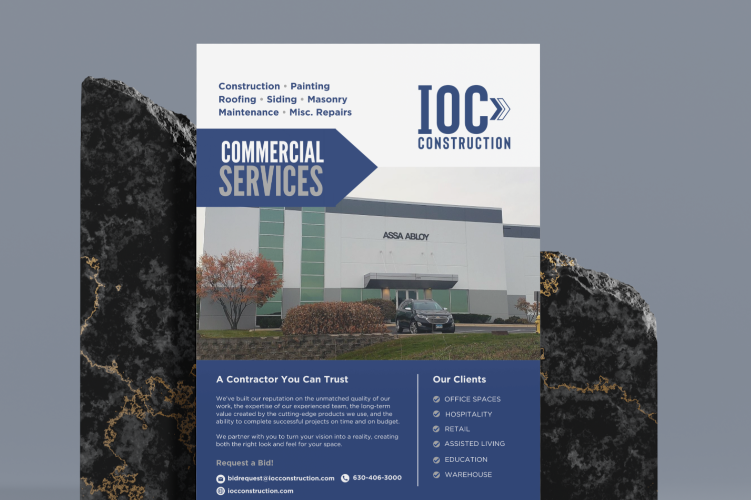
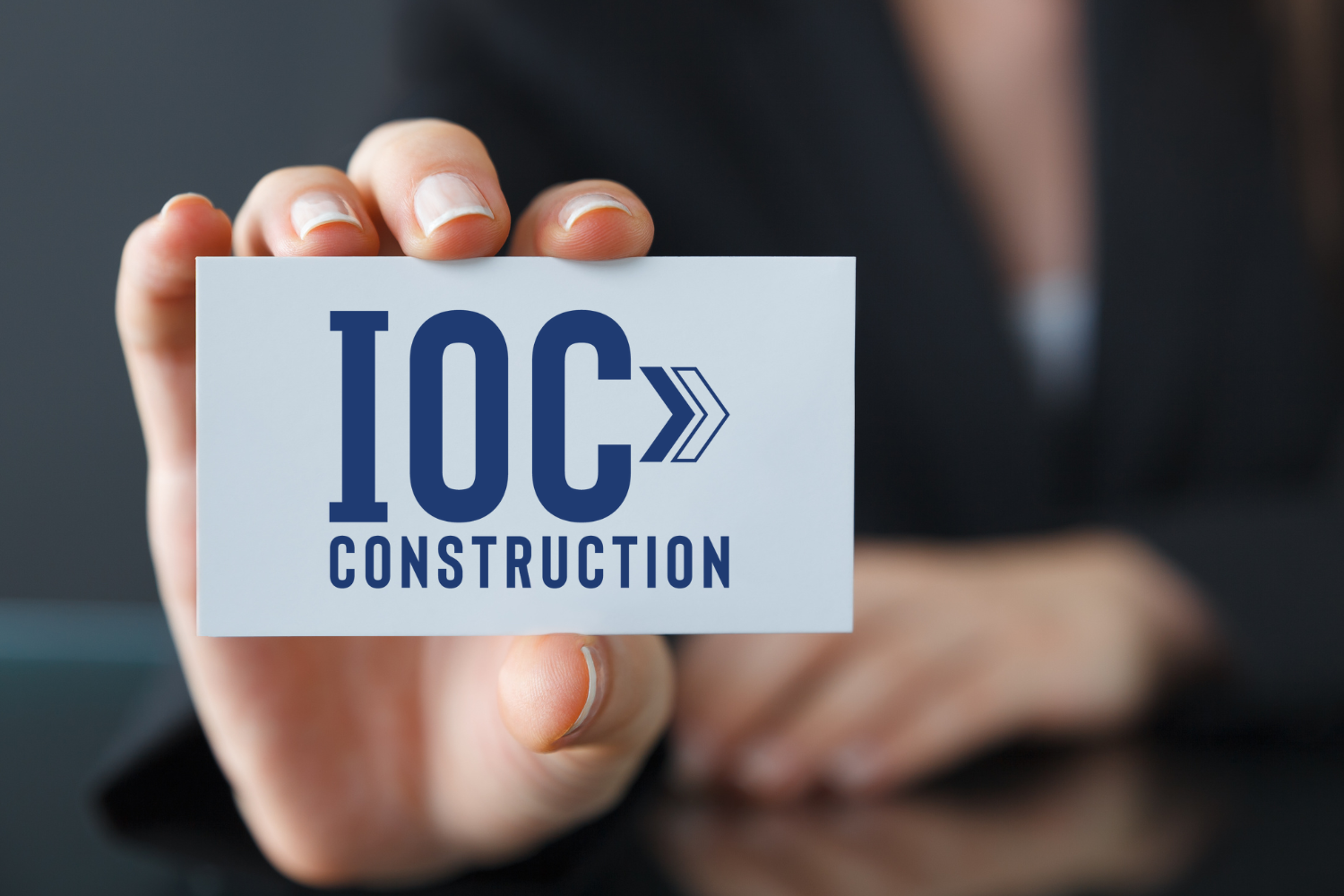
The Branding Den developed a revitalized brand identity that positioned the company as an industry leader while maintaining its heritage. A key element of the redesign was the creation of a new logo, featuring an arrow symbol that represents growth, innovation, and forward momentum—values that align with the company’s strategic vision. The typography selection was equally intentional; a bold and strong font was chosen to reflect the expertise and reliability the company has built over decades.
Beyond the logo, we crafted a comprehensive brand style guide to ensure consistency across all marketing channels. This guide established clear guidelines for logo usage, typography, color palettes, and other visual elements to maintain a cohesive and professional appearance.
Creative Delivered
This strategic brand refresh has positioned the company for continued growth, reinforcing its reputation while appealing to a broader audience in an evolving industry.